


Designing the digital experience for Qaysari
- Company: Qaysari
- Industry: E-Commerce
- Headquarters: Kurdistan Region
- Use case: UI/UX Design & Prototyping
The challenge
Qaysari is an e-commerce product from the Kurdistan Region that aims to bring the experience of a historic bazaar online. Before this project it had no visual language of its own. The bazaar's offline navigation is complex and hard to map to screens, there was no user flow for buying from multiple vendors, and branding was inconsistent across the places customers might meet it.
What we designed
This was a design and prototyping project. The research started from the bazaar itself: a busy market, divided into sections, that people know how to walk but that does not map neatly onto a phone screen. UX research and mapping turned that navigation into user journeys for browsing and checkout, and those journeys shaped each screen.
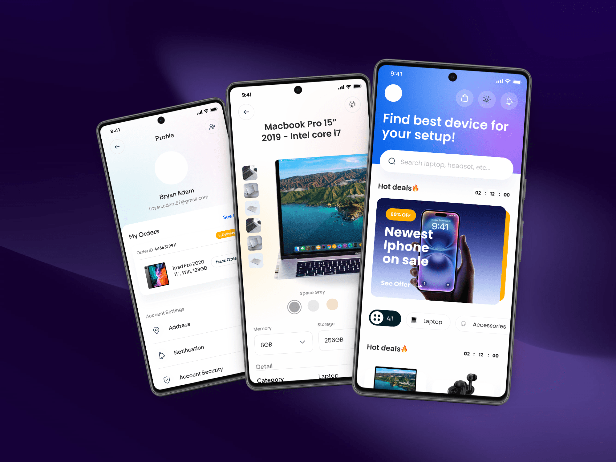
Home. Search sits at the top ("Search laptop, headset, etc."), so a shopper who knows what they want can skip the browsing. Category chips (All, Laptop, Accessories) stand in for the bazaar's sections, and a Hot deals strip with a countdown brings the day's offers to the front.
Product page. Large photos with a strip of thumbnails, colour swatches, and memory and storage options chosen on the page, with the details underneath, so the questions a shopper would ask a seller are answered on the screen.
Profile. Orders show their delivery status next to a Track Order button, and the address, notifications and account security sit under account settings.
The app interface was designed mobile-first. A design system and component library defines the reusable parts of the interface, such as cards, chips, buttons and inputs, so every screen stays consistent. Vendor and customer dashboards were designed for both sides of the marketplace. The work was delivered as high-fidelity, interactive prototypes in Figma.
The outcome
Qaysari received a complete high-fidelity design system and interactive prototypes for its MVP: a modern, mobile-first UI design system, clear journeys for browsing and checkout, a vendor dashboard interface, and one brand identity applied consistently.
The results
Before
No existing visual language for the digital product
Complex offline navigation difficult to map digitally
Lack of user flow for multi-vendor purchasing
Inconsistent branding across potential touchpoints
After
Modern, mobile-first UI Design System
Intuitive user journeys for browsing and checkout
Seamless vendor dashboard interface design
Unified brand identity and visual consistency
Key Features Used
- Mobile-First App Interface Design
- User Experience (UX) Research & Mapping
- High-Fidelity Prototyping (Figma)
- Design System & Component Library
- Vendor & Customer Dashboard UI
Services on this project
Let us handle the technical heavy lifting
Enough thinking. You have the vision, we have the engineering. Let's combine forces and launch something world-class.
Rapid Support
Free Consultation